Click here to see original article.
Here we go again…
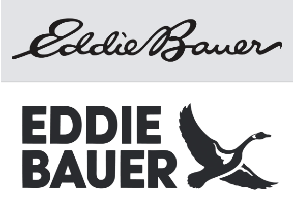
I couldn’t tell you much about Eddie Bauer. In my mind it’s just another outdoor clothing company that treads water in the sea of sameness brands that aspire to be Patagonia. But the one thing I do know about them is, without a prompt, I can recall their logo. That’s because over the last 59 years the company has proudly used its characterful cursive brand mark. So, on the limited times I’ve encountered the brand I’ve been exposed to its distinctive cursive script logo. This in turn has created deep subconscious memory structures that allow me to at least recognize and have some familiarity – although limited – with the brand.
So, it confounds me to read that after being fed and swallowing the nonsensical lie that “Gen Z can’t read cursive,” 59 years of priceless equity is being destroyed and replaced with an unrecognizable and nondescript all caps block letter logo. Yes, this brand certainly has much work to do, but this decision is yet another example of naive marketers making change for changes sake, which only serves to diminish what little equity the brand has rather than moving it forward.
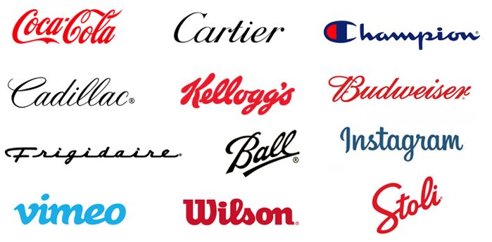
I wonder why The Coca-Cola Company, Cartier and Champion – to name but a few – have all come to a different conclusion..?
Click here to see original LinkedIn post.


